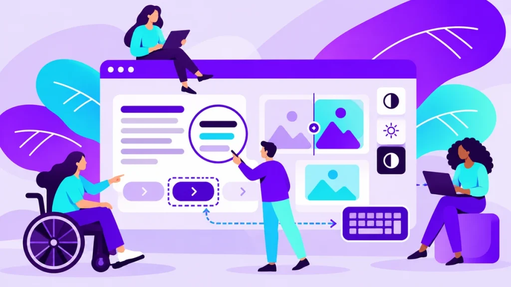
A website is easier to use when text is readable, navigation is clear, forms make sense and important tasks do not depend only on a mouse or an image. Plan accessibility from the start and test real tasks, including keyboard use and screen reader support.
These improvements help many people, including visitors with disabilities, someone using a small screen and someone watching a video in a noisy place. There is no single button that automatically fixes every problem.
Start with clear content
Write a headline that tells visitors what the page contains. Break up long blocks of text with short paragraphs, useful subheadings and lists where they improve understanding.
Buttons should describe the action. A label such as Send an enquiry is clearer than a collection of identical Click here buttons.
Check:
- Whether people understand the offer without specialist terminology.
- Whether headings follow a logical order.
- Whether link labels make sense out of context.
- Whether essential information exists only inside an image.
If text embedded in an image contains information needed for a decision, provide it as ordinary page text too. People can then read, search and enlarge it more easily.
Consider colour and text size
Light grey letters on a white background may look elegant on a designer's screen but can be difficult to read. Check the contrast of the combinations you actually use.
Do not communicate meaning through colour alone. A red border around an incorrect form field should come with a message explaining what needs correcting.
Let people enlarge the page without losing access to important functions. Test longer text, smaller screens and different browser window widths.
Your brand colours can remain part of the design without becoming the only way to express every message. Readability and a recognisable identity can work together.
Can people navigate using a keyboard?
Some visitors do not use a mouse. Try moving through menus, links and forms with the Tab key, making sure the selected element stays visible.
When you open a menu or dialog, check whether you can close it and continue where you left off. A visitor should not become trapped in one part of the interface.
A practical test includes:
- The order of interactive elements.
- A clearly visible focus indicator.
- Buttons and forms that work without a mouse.
- A way to bypass repeated navigation.
Keyboard testing is simple and can reveal serious obstacles quickly. A thorough review also needs other methods and people with different ways of using the site.
How should you handle images, video and audio?
A photograph that communicates important information needs meaningful alternative text. A decorative image does not need to repeat what the adjacent paragraph already says.
Alternative text is not a place to pile up search keywords. Describe what matters for understanding that particular image in its context.
Provide captions for video where possible, and consider a text version of important explanations. Automatically generated captions can be a starting point, but review names and technical terms carefully.
The The English Book Digital project combines different media in a learning experience. When planning similar content, consider how learners can use each type of material.
What makes a form understandable?
Each field needs a visible label and clear instructions when a special format is required. An example can help, but it should not replace a label that remains visible.
If submission fails, explain which fields need attention. Keep already entered information where possible so the visitor does not have to start again.
Test the form on a phone and with a keyboard. Check whether the visitor receives a clear success message and whether the enquiry reaches your team.
A form with fewer unnecessary fields is easier for everyone. During an initial enquiry, request only what you actually need to reply.
How do you check and improve a site?
Automated tools can identify some issues, but they cannot establish that a website is understandable and usable on their own. Combine them with manual testing of real tasks.
Ask different people to find a service, send an enquiry or complete a lesson. Watch where they pause instead of immediately telling them where to click.
The web services overview describes our work, and you can contact us with a task your visitors need to complete. That is a useful starting point for an improvement plan.
Example review of a service page
Open the page for your most important service and try using it without a mouse. Move from the headline through the explanation and project examples to the form, noticing where focus becomes difficult to follow.
Then zoom the page and check whether text remains readable, buttons remain available and the order still makes sense. If a dialog appears, try closing it and returning to your previous place.
Record specific obstacles:
- A link whose label does not explain its destination.
- A form with no persistent field labels.
- An error shown only through colour.
- Unreadable words placed over a photograph.
- A video without an accessible explanation.
Fix obstacles that prevent an important task, such as sending an enquiry, first. Then improve the rest of the experience, including consistent navigation.
Include real users in the review when possible. Testing by someone who knows the site's code cannot fully replace the experience of a person who regularly uses assistive technology.
Repeat essential checks after major design changes. A new form, image or animation can introduce accessibility problems after the initial launch.
Do not check only the homepage. Someone may land directly on an article or service page from search, so that page also needs a clear heading, usable navigation and a way to make contact. Testing the most important entry points often reveals more than a quick review of the overall design.
Frequently asked questions
Will an accessibility plugin solve everything?
No. Design, structure, copy, forms and functions still need to be checked and improved on the website itself.
Does every image need a long description?
No. Alternative text should convey the image's relevant information, while decorative images should avoid unnecessary repetition.
What is a quick first test?
Complete an important task using only the keyboard, then zoom the mobile page. Follow this with more detailed checks.
Will accessibility change my brand's appearance?
It may require clearer contrast and more readable components, but these can still fit your visual identity.